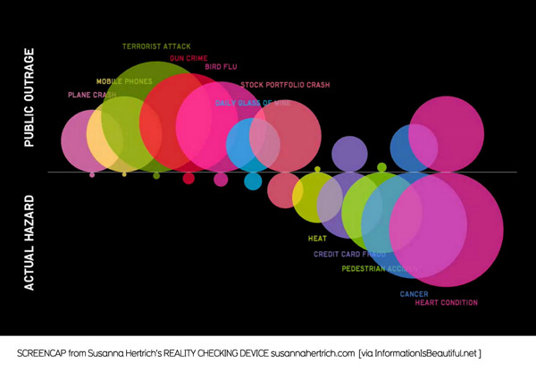
A creative use of information
After reading a statement on a website like…
Look how we can save you more money than our competitors!
…or…
Look how we’re delivering a better service for our customers!
…chances are you’ll be greeted by an information graphic (or infographic) backing up said claim.
If complimented by sufficient summaries and visual highlights, infographics can maintain the reader’s interest and, crucially, let them get on with the task in hand.
But the options for visualising data don’t necessarily have to start and end with the usual bar charts, pie charts or scatter diagrams – there’s always room for a little imagination.
Take Artist and designer Susanna Hertrich’s Reality Checking Device – an interactive visual device for calculating the proportion of public outrage to life’s hazardous scenarios. Even ignoring the subject matter and it’s physical form, you have to admire the technique she’s used for rendering the data – it’s smart, powerful and, above all, simple. There’s not a number in sight.
Susanna’s visualisation technique could even be used in a few ways during a web project. How about a similar graphic which puts the needs of a business up against those of their readers? All subjective of course, but potentially impacting for stakeholders nonetheless.
My greyscale efforts of visualised data for this blog are, admittedly, more than a little tepid in comparison. Susanna’s and other such beautiful information renditions have certainly inspired me to think a little more creatively in future.
