Visualising Data: Seeing is Believing
A fews weeks ago in late October I had the pleasure of speaking at CS Forum 2012 in Cape Town, South Africa. I couldn’t have been more excited by the prospect of talking before an audience of content professionals about a subject that’s become very near to my heart for the past couple of years: visualising data. Here is a transcript of my talk.
Visualising Data: Seeing is Believing
As humans, our ability to observe and analyse the contents of the world around us is both unique and astonishing, but so too is our capacity to form verbal and visual concepts. These seem to be the principal factors which have worked to our adaptive advantage in competition with other animal species. We are, in one respect at least, superior to other animals because we have developed a greater variety of systems of communication and expression, and one of these is art.
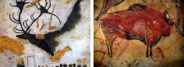
Figure 1 – Paleolithic Era cave paintings of giant elk and bison. Discovered in France and Spain respectively.
Indeed, some of the earliest known preserved examples of human expression (Figure 1) demonstrate our incredible ability to bring chaotic and complex environments under control through the magic of art, because to illustrate something is to transform it into whatever form or shape we want. And though we’ll never know for certain what our prehistoric ancestors were thinking when they painted pictures of cows, horses, bison and deer on the walls of caves, it is thought that because their paintings showed large and dangerous wild animals rather than humans, that this was their attempt to bring them under control — to tame them. It’s an interesting theory, particularly when we consider how many of these animals would come to be domesticated by humans thousands of years in the future.
So if art and other forms of creative expression are the power to transform and interpret, then science is the great identifier and unifier, and there a few better collisions of these two cultures than a diagram.
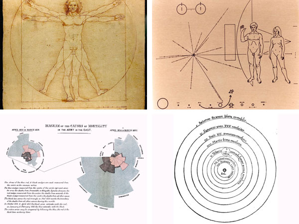
Figure 2 – Examples of Famous diagrams (clockwise from left): Da Vinci’s Vitruvian Man, the Pioneer Plaques, Florence Nightingale’s coxcomb diagram, Copernicus’s heliocentric universe.
Our history is littered with instantly recognisable diagrams (Figure 2). At their most potent they have the ability to express complex ideas simply, and an intellectual and artistic beauty that has the power to shift our perspectives or change our mind about things. Often it’s that desire for simplicity and beauty that leads to the truth.
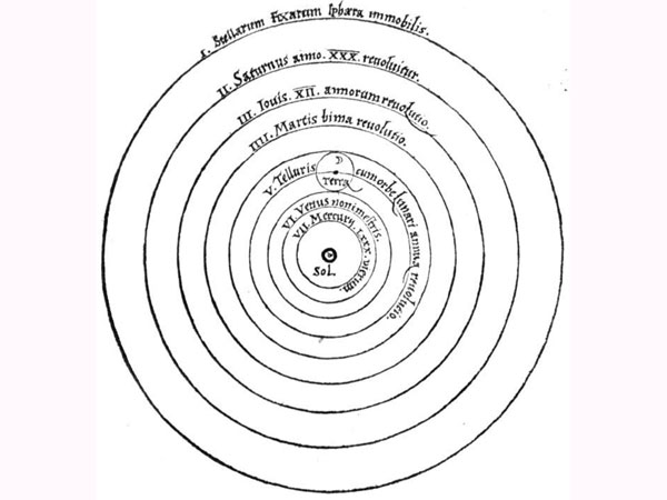
Figure 3 – Copernicus’s heliocentric universe diagram. He had to move heaven and earth to draw it. (c. 1543).
Take, for example, Nicolaus Copernicus’s heliocentric model of the solar system (Figure 3), which would come to revolutionise the way we look at our place in the universe. For over two thousand years scholars and religious scriptures were steadfast in their belief that our planet was the static centrepiece of the universe, but Copernicus — then a little-known Polish cleric — dared to think along different lines. His concept revealed the solar system as we know and understand it: not with Earth at its centre, but the Sun. This radical new arrangement of the universe just seemed unreasonable and ridiculous at the time, with Earth millions of miles away from where it was supposed to be positioned. So how did Copernicus support his theory?
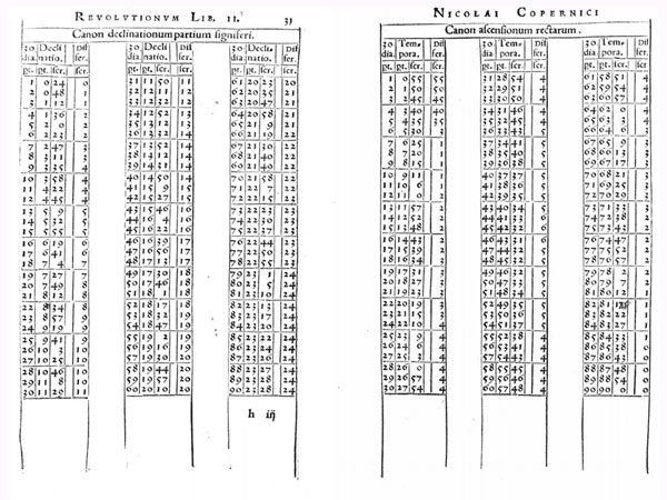
Figure 4 – Copernicus’s ‘On the Revolutions of the Celestial Spheres’ contains thousands of years worth of astrological data (c. 1543).
One thing you immediately notice as you scan through his life’s work “On the revolutions of the Celestial Spheres” are the amount of pages filled with numerical data (Figure 4), but they weren’t all his own. Copernicus not only relied on his own astrological data to recalculate the planetary positions, but thousands of years worth of previous observations by others. All this data underpins the completed diagram.
But despite the weight of its foundations, the beauty of his diagram lies in its simplicity. If you or I wanted to quickly explain the arrangement of our solar system to someone, you’d probably sketch something a lot like it. That it still hasn’t been bettered is testament to his achievement.
The data revolution
For someone whose investigations involved using data from several external sources, you wonder what Copernicus would have made of today’s huge democratisation of data. Right now we’re increasingly seeing barriers lowered between ourselves and rich data sets containing information about our communities, our politics and our governments. It’s not some fanciful idea to suggest that wider public access to numbers and statistics offers us a clearer picture of what’s really going on in the world, and that with this knowledge we can begin to make our lives better at a local, national and international level. As citizens, we should all be very excited indeed about the pace of this digital data revolution.
Tools
One of the exciting offshoots of this has been the emergence of powerful new tools for interrogating and presenting data. Tools which can help us all make better sense of our environments, help us find out if the things we think and believe are actually true or not, and communicate our findings in a way that our audiences understand and can act upon.
What’s great about this sort of work is that a lot of the stuff used to do it is freely available to everyone. None of these tools used for data extraction, exploration and visualisation will cost you money at their basic level to access and use at their basic level.
- Gephi
- Google Chart Tools
- Google Fusion Tables
- Google Refine
- Lucid Chart
- ManyEyes
- OpenStreetMap
- ScraperWiki
- Tableau Public
Where we fit in
I’m at pains to point out that I’m not a data scientist, nor am I a statistician, or mathematician; I’m just someone who has found visualising data to be both an effective way to gain a deeper understanding of the hidden processes that exist within organisations, and to amplify and simplify the communication of my content strategy recommendations and arguments to other audiences — namely decision makers. Essentially, it’s about trying to have a two-way conversation with the people who can effect change within an organisation using data-driven visual communication. What I’m not advocating for needn’t be a great deal of added work on your plate. The idea is to make effective use of some of the existing tools and deliverables you would typically call upon during a project’s discovery phase. Let’s take a look at a few ways we can do this.
The hidden people networks
One of the many effective methods of analysing the lifecycle of an organisation’s content is to conduct one-on-one interviews with key members of the authoring team, but finding the ideal people to speak to in a multi-departmental organisation isn’t always that easy. Consulting a hierarchical organisation chart can be helpful, but what they don’t reveal are those hidden relationships that are forged by everyday collaborative content work.
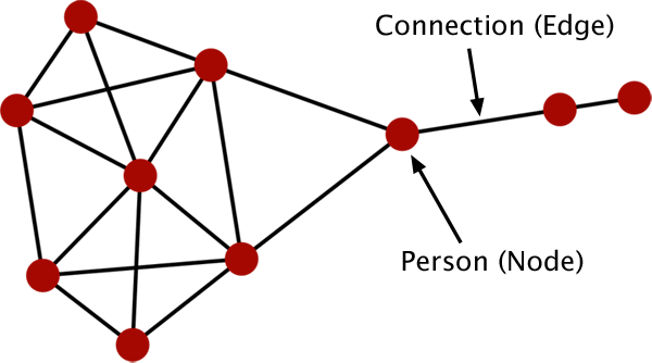
Figure 5 – A sociogram visualises the interpersonal relationships within a group. It is composed of nodes (individuals) connected by edges (relations).
A sociogram (Figure 5) is a visualised representation of the structure and patterns within a social network. They can be a powerful tool for discovering deeper meanings behind the relationships and communities within a network of people, and can be used to quickly reveal community clusters and calculate network science parameters such as degree and betweenness centrality.
Degree
The degree of a node calculated by the number of edges that are adjacent to it. So by ranking each node within a social network by degree, we can distinguish which individuals have the most connections (Figure 6).
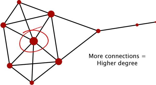
Figure 6 – A sociogram ranked by degree. The more connections an individual has the higher their degree.
Betweenness centrality
Betweenness Centrality measures how often a node appears on the shortest paths between nodes in a network. So by ranking each node within a social network by betweenness centrality, we can distinguish which influential individuals have the most connections across distinct community clusters (Figure 7).
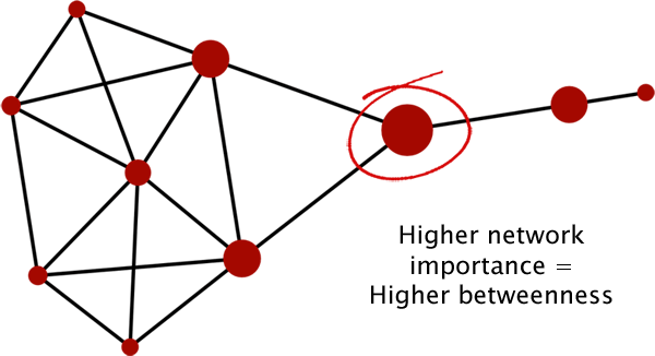
Figure 7 – A sociogram ranked by betweenness centrality. The more connections an individual has to different community clusters the higher their betweenness.
Let’s build a sociogram
All content management systems (CMSs) and intranets worth their salt automatically generate and store logs which maintain a history of activity performed on them. With information on each page requests, including when they were created, edited and who was responsible, to name but a few, it is possible to chart the lifecycle of content pieces or whole pages. If you, your database or CMS manager, or someone equally clever, extracts a set of site-wide logs for a specified period, then you can put together your very own sociogram using the data.
Once opened in a rich text text editor, your log file might look a bit like this:
#Fields: date time c-ip cs-username s-ip s-port cs-method cs-uri-stem cs-uri-query sc-status cs(User-Agent)
2012-09-03 00:10:19  XXX.XXX.X.211 clarke_n  XXX.XXX.X.103 80 GET /admin/pages/content.php?id=84 Cmd=contents 200 Mozilla/4.76+[en]+(X11;+U;+Linux+2.4.9-ac7+i686;+Nav)
2012-09-03 00:10:39  XXX.XXX.X.17 olson_b  XXX.XXX.X.103 80 GET /admin/pages/content.php?id=37 Cmd=contents 200 Mozilla/4.76+[en]+(X11;+U;+Linux+2.4.9-ac7+i686;+Nav)
2012-09-03 00:11:12  XXX.XXX.X.40 zajac_s  XXX.XXX.X.103 80 GET /admin/pages/content.php?id=37 Cmd=contents 200 Mozilla/4.76+[en]+(X11;+U;+Linux+2.4.9-ac7+i686;+Nav)
2012-09-03 00:13:20  XXX.XXX.X.29 arecchi_f  XXX.XXX.X.103 80 GET /admin/pages/content.php?id=168 Cmd=contents 200 Mozilla/4.76+[en]+(X11;+U;+Linux+2.4.9-ac7+i686;+Nav)
2012-09-03 00:13:50  XXX.XXX.X.107 chalmers_s  XXX.XXX.X.103 80 GET /admin/pages/content.php?id=174 Cmd=contents 200 Mozilla/4.76+[en]+(X11;+U;+Linux+2.4.9-ac7+i686;+Nav)
2012-09-03 00:13:52  XXX.XXX.X.178 harding_a  XXX.XXX.X.103 80 GET /admin/pages/content.php?id=174 Cmd=contents 200 Mozilla/4.76+[en]+(X11;+U;+Linux+2.4.9-ac7+i686;+Nav)
2012-09-03 00:14:38  XXX.XXX.X.107 chalmers_s  XXX.XXX.X.103 80 GET /admin/pages/content.php?id=73 Cmd=contents 200 Mozilla/4.76+[en]+(X11;+U;+Linux+2.4.9-ac7+i686;+Nav)
That might have been too much, too soon. Let’s take a closer look at a single entry.
2012-09-03 00:09:53 XXX.XXX.X.104 russell_g XXX.XXX.X.103 80 GET /admin/pages/content.php?id=12 Cmd=contents 200 Mozilla/4.76+[en]+(X11;+U;+Linux+2.4.9-ac7+i686;+Nav)The highlighted fields are the ones we’re particularly interested in. They are: date, time, client ip address (c-ip), client username (cs-username) and the content accessed (cs-uri-stem).
With this mind we can return to our scary log file. What we’re looking for is the same content or page accessed by two or more different authors within a certain timeframe. I’ve highlighted two such examples below:
#Fields: date time c-ip cs-username s-ip s-port cs-method cs-uri-stem cs-uri-query sc-status cs(User-Agent)
2012-09-03 00:10:19  XXX.XXX.X.211 clarke_n  XXX.XXX.X.103 80 GET /admin/pages/content.php?id=84 Cmd=contents 200 Mozilla/4.76+[en]+(X11;+U;+Linux+2.4.9-ac7+i686;+Nav)
2012-09-03 00:10:39  XXX.XXX.X.17 olson_b  XXX.XXX.X.103 80 GET /admin/pages/content.php?id=37 Cmd=contents 200 Mozilla/4.76+[en]+(X11;+U;+Linux+2.4.9-ac7+i686;+Nav)
2012-09-03 00:11:12  XXX.XXX.X.40 zajac_s  XXX.XXX.X.103 80 GET /admin/pages/content.php?id=37 Cmd=contents 200 Mozilla/4.76+[en]+(X11;+U;+Linux+2.4.9-ac7+i686;+Nav)
2012-09-03 00:13:20  XXX.XXX.X.29 arecchi_f  XXX.XXX.X.103 80 GET /admin/pages/content.php?id=168 Cmd=contents 200 Mozilla/4.76+[en]+(X11;+U;+Linux+2.4.9-ac7+i686;+Nav)
2012-09-03 00:13:50  XXX.XXX.X.107 chalmers_s  XXX.XXX.X.103 80 GET /admin/pages/content.php?id=174 Cmd=contents 200 Mozilla/4.76+[en]+(X11;+U;+Linux+2.4.9-ac7+i686;+Nav)
2012-09-03 00:13:52  XXX.XXX.X.178 harding_a  XXX.XXX.X.103 80 GET /admin/pages/content.php?id=174 Cmd=contents 200 Mozilla/4.76+[en]+(X11;+U;+Linux+2.4.9-ac7+i686;+Nav)
2012-09-03 00:14:38  XXX.XXX.X.107 chalmers_s  XXX.XXX.X.103 80 GET /admin/pages/content.php?id=73 Cmd=contents 200 Mozilla/4.76+[en]+(X11;+U;+Linux+2.4.9-ac7+i686;+Nav)
Next we want to extract these usernames (cs-username), including others that fitted our criteria, and add them to a two-columned spreadsheet (Figure 8) with the first set of usernames under a column heading of Source and the second under Target. Our examples had olson_b and chalmers_s acting as the sources and zajac_s and harding_a as the targets.
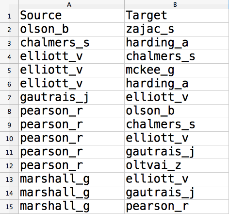
Figure 8 – A two-columned spreadsheet with extracted usernames.
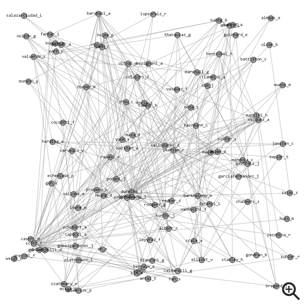
Once all the usernames have been added, we can save the sheet as a comma-separated values (CSV) file and import them into some graph visualisation software, such as Gephi. We might initially see something like this huge mess of nodes and edges (Figure 9).
Running a layout algorithm
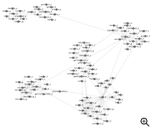
Though it’s not making a very clear job if it right now, what this rendering is showing us are the links that exist between all the people who have edited content pieces consecutively. If we were to run a good quality layout algorithm, we would begin to see the clusters of connected nodes forming (Figure 10).
I’ve used Gephi’s own ‘Force Atlas 2’ to position these nodes in an aesthetically pleasing way. This is now looking much more like a sociogram. We can easily see the different communities to which these individuals are connected identified in the graph.
Ranking nodes by degree
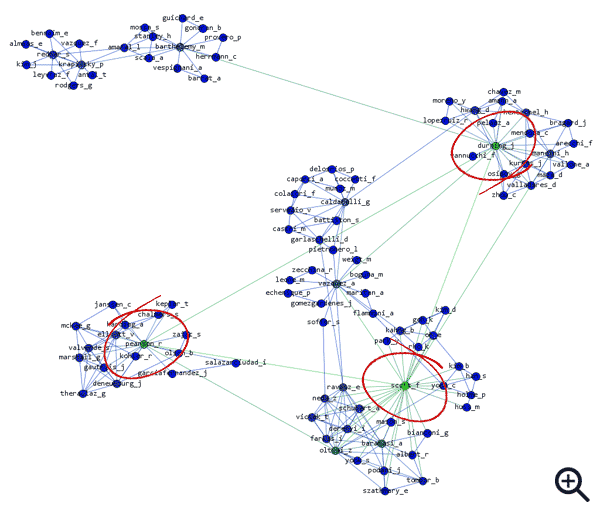
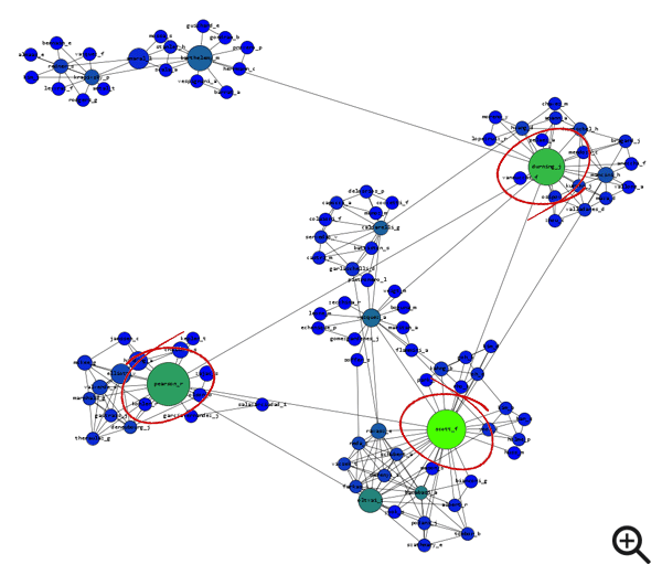
To help us see the most important individuals in the network, we need to rank these nodes by degree. We’ll illustrate this by changing the colours of each node depending on the number of connections they have (Figure 11). In our sociogram, the ‘greenest’ nodes have the highest degree.
Ranking nodes by betweenness centrality
Next we’ll find which influential individuals have established the most connections across distinct community clusters. To do this we’ll rank the nodes by betweenness centrality (Figure 12). In our sociogram, the largest nodes have the highest ‘betweenness’.
Filtering nodes to reveal strongest group
Despite using both colour and size to help us see who are the most influential nodes in this network, it is still a little too crowded. So we’ll use a filter to remove the weaker nodes in our sociogram (Figure 13).
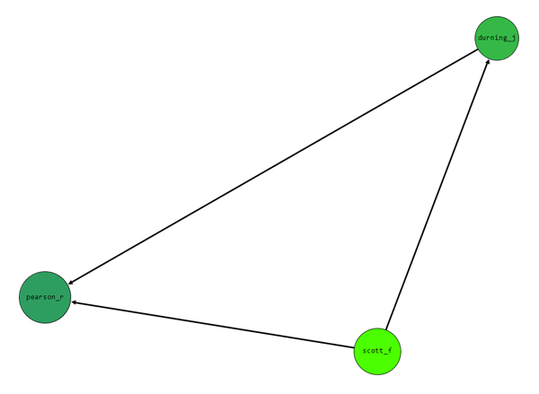
Figure 13 – Nodes filtered to reveal strongest group.
Now we are left with the three individuals who carry the most influence. One or all of durning_j, scott_f, and pearson_r might well occupy lower positions on an organisational chart than others, but their importance to the way content flows around this organisation means they are clearly worthy of our attention.
Lessons
By extracting and visualising the data contained in a log file we were able to:
- See the different community clusters to which people were connected
- See which individuals held the most influence over multiple groups
- Create an alternative organisational chart useful to any content strategist who’s been air-dropped into a project
Relationships between content
NOTE: I am indebted to Dorian Taylor for this idea. Do yourself a favour and read everything he’s ever written, particularly his article “No Longer No Sense of an Ending” which featured in issue 3 of Contents Magazine.
In a piece on his website titled “visualizing paths through the web“, Dorian introduces us to a rendering of the most frequently-trodden paths through his website:
When auditing content for the Web, it’s important to remember that although many of us still write Web content as isolated documents, they are very rarely read that way. It’s entirely feasible for a reader to encounter inconsistent or confusing writing between one page and the next. In order to fully appreciate the story we’re telling our audience, we should look at it in context.
Using the same techniques as Dorian I was able to create my own rendering of the most frequently-trodden paths through the website of a fictitious UK bus and coach operator (Figure 14). The potential is there to learn to learn a great deal about the way the content relates to one another.
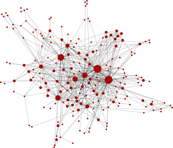
Figure 14 – Mapping the movement of users between the web pages of a fictional UK bus and coach operator.
But before we begin the task of rendering one ourselves, let me use a couple of simplified examples to explain what we’re looking at (Figure 15).
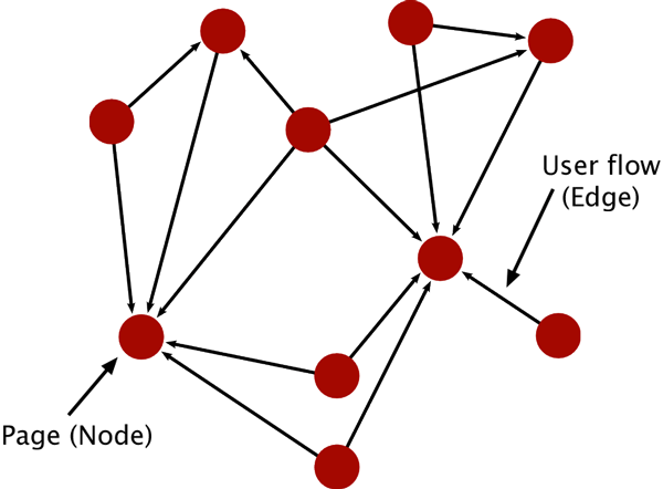
Figure 15 – Simplified network of the flow of users between web pages.
Each node represents an individual page on the website, while rach directed edge represents the flow of users, or traffic, between two pages.
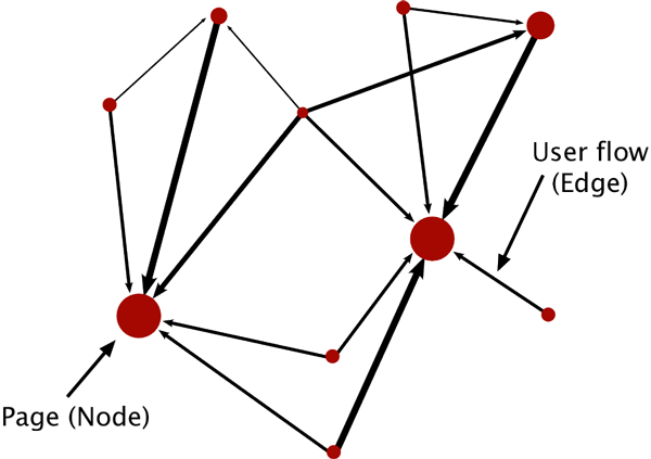
Figure 16 – Weightier nodes and edges indicate key paths and stops.
In this example (Figure 16), the larger nodes in the graph have a higher PageRank, which is essentially a higher importance in relation to the other pages in the network, while the thicker directed edges indicate a higher frequency of flow between two pages.
In his piece, Dorian goes on to point out that web servers log information on every available referring resource (the previous page) and each new request (the next page) we make.
When opened in a rich text editor, your web server log file might well look a bit like this:
XX.XXX.XXX.86 [30/Aug/2012:11:09:27 +0100] GET /contact-us/ HTTP/1.1 200 14728 - "http://www.crosscountrycoaches.com/destinations/" "Mozilla/5.0 (Windows NT 6.0; rv:14.0) Gecko/20100101 Firefox/14.0.1"
XX.XXX.XXX.86 [30/Aug/2012:11:09:29 +0100] GET / HTTP/1.1 200 12007 - "http://www.crosscountrycoaches.com/destinations/" "Mozilla/5.0 (Windows NT 6.0; rv:14.0) Gecko/20100101 Firefox/14.0.1"
XX.XXX.XXX.86 [30/Aug/2012:11:09:29 +0100] GET /contact-us/view-your-ticket/ HTTP/1.1 200 14084 - "http://www.crosscountrycoaches.com/" "Mozilla/5.0 (Windows NT 6.0; rv:14.0) Gecko/20100101 Firefox/14.0.1"
XX.XXX.XXX.86 [30/Aug/2012:11:09:37 +0100] GET /services/ HTTP/1.1 200 13428 - "http://www.crosscountrycoaches.com/" "Mozilla/5.0 (Windows NT 6.0; rv:14.0) Gecko/20100101 Firefox/14.0.1" XX.XXX.XXX.86 [30/Aug/2012:11:09:38 +0100] GET /login/ HTTP/1.1 200 17284 - "http://www.crosscountrycoaches.com/services/" "Mozilla/5.0 (Windows NT 6.0; rv:14.0) Gecko/20100101 Firefox/14.0.1"
XX.XXX.XXX.86 [30/Aug/2012:11:09:42 +0100] GET /reprint-your-ticket/ HTTP/1.1 200 27788 - "http://www.crosscountrycoaches.com/services/" "Mozilla/5.0 (Windows NT 6.0; rv:14.0) Gecko/20100101 Firefox/14.0.1"
XX.XXX.XXX.86 [30/Aug/2012:11:09:42 +0100] GET /services/terms-and-conditions/ HTTP/1.1 200 11638 - "http://www.crosscountrycoaches.com/reprint-your-ticket/" "Mozilla/5.0 (Windows NT 6.0; rv:14.0) Gecko/20100101 Firefox/14.0.1"
You could be forgiven for thinking it exactly like the log file sample we saw earlier, but there are some subtle differences. From this log file sample we want to locate each referrer-referent connection (previous and next page) that come under matching client ip addresses. To simplify things let’s focus on two particular entries. The fields we’re interested in are (in highlighted order) client ip, next page URL and previous page URL.
XX.XXX.XXX.86 [30/Aug/2012:11:09:29 +0100] GET /contact-us/view-your-ticket/ HTTP/1.1 200 14084 - "http://www.crosscountrycoaches.com/" "Mozilla/5.0 (Windows NT 6.0; rv:14.0) Gecko/20100101 Firefox/14.0.1" XX.XXX.XXX.86 [30/Aug/2012:11:09:42 +0100] GET /reprint-your-ticket/ HTTP/1.1 200 27788 - "http://www.crosscountrycoaches.com/services/" "Mozilla/5.0 (Windows NT 6.0; rv:14.0) Gecko/20100101 Firefox/14.0.1"With the help of our friendly web server manager it is possible to turn this log into a list of page-by-page connections, each weighted by the intensity of the traffic flowing between them. Cleaning the data is simply case of stripping it of all non-human visits by web crawlers like Google Bot, Bing Bot and others. Unless your site is about robots or creepy-crawlies you can safely remove any mentions of ‘bots’, ‘spiders’ and ‘crawlers’.
As before, we want to extract these URL’s and others that fitted our criteria and add them to a two-columned spreadsheet (Figure 17). The referring URLs should be placed under a column heading of Source and the referent URLs under Target. Finally, we need to save the sheet as a comma-separated values (CSV) file.
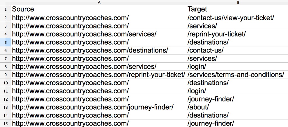
Figure 17 – A two-columned spreadsheet with extracted page URLs.
Introducing Cross Country Coaches
Before I continue I wish to formally introduce you to our fictional UK bus and coach operator, who will be acting as a working example for the remainder of this talk. Cross Country Coaches’ main services include airport runs, day trips to major UK towns and cities, holiday camps and amusement parks, as well as sporting and music events. Everything on their website should be geared towards the journey planner; the starting point from where e-tickets can be purchased.
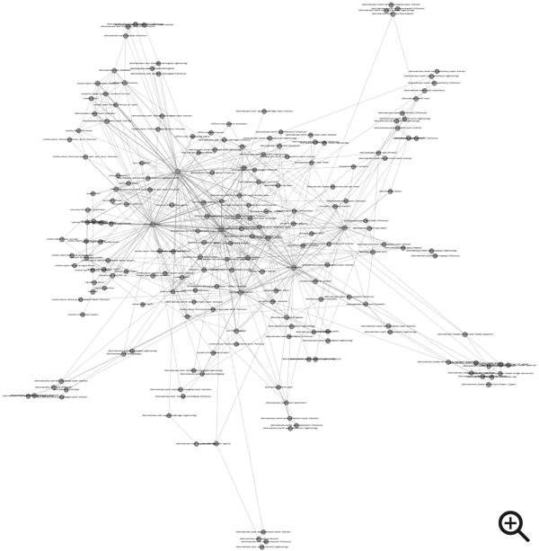
If we were to import the extracted URL data into Gephi we might see something like this even larger mess of randomly distributed nodes and edges (Figure 18).
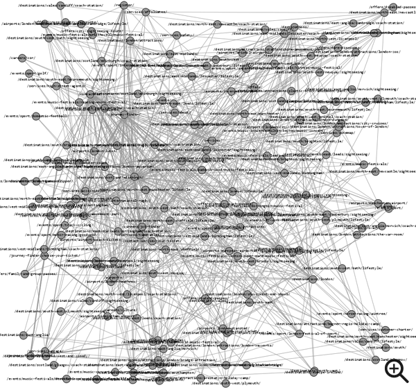
Figure 18 – Gephi rendering of referrer/referent URLs extracted from web server logs (click image to zoom).
Running a layout algorithm
We’ll run the same layout algorithm as before (Gephi’s Force Atlas 2) to position our nodes in an aesthetically pleasing way (Figure 19).
Ranking nodes by PageRank
To help pick out the most important pages in the network, we’ll use colour and size to rank our nodes by ‘PageRank’ (Figure 20).
Filtering nodes to reveal strongest group
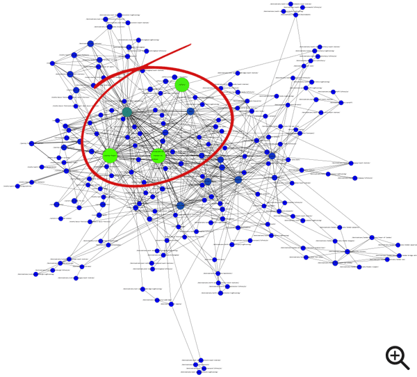
The colour and size of nodes are helping us to see what is the most influential content in this network, but we could benefit from clearing away the clutter. This level of complexity may suit someone who is close to the data but for those that are not we should consider filtering out the network’s weaker nodes (Figure 21).
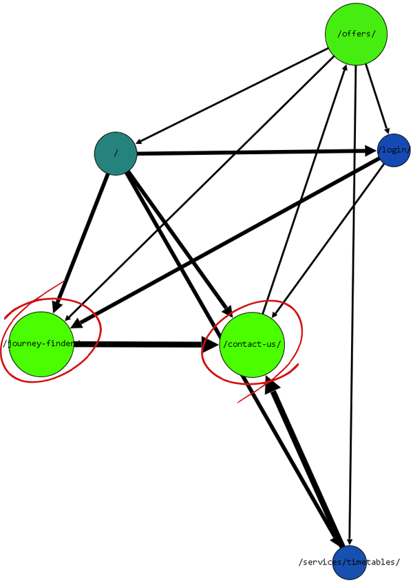
Figure 21 – Nodes filtered to reveal strongest group.
Probably the most interesting part of this simplified network to note is the amount of arrows which point towards /contact-us/, particularly from the /journey-finder/. That many are choosing to leave this process of buying an e-ticket to contact Cross Country Coaches is interesting and would be well worthy of further investigation.
Nevertheless, what we have ourselves is a sample of the most frequently-trodden paths through this website — a very useful starting point for any investigation into a website’s content. So we’ll export the node data as a .csv as this will come in handy for the final part of this talk.
Lessons
By extracting and visualising the URL data contained in a web server log file, we were able to:
- Provide a different perspective on the stories we’re telling our audiences
- Filter the data to reveal the key paths and stops users are making
- Generate a sample of the the most frequently accessed content for this website
Playing with numbers
Using internal data
We can add further value and depth to our visualisations by informing them with data from our own investigations. We’ll take our exported node table and manually add a set of new columns full of data extracted from a recent audit of Cross Country Coaches’ website (Figure 22).
For example, we could add data on which department (Responsibility (Dept)) and individual (Responsibility (Individual)) is responsible for maintaining each page, whether the content is maintained in-house or by external parters (Source), when the content was last updated (Last update) and criteria for measuring the quality of the content (Actionability, Accuracy and Usability).
To speed this process up we could enlist the help of Google Fusion Tables to merge data across two spreadsheets by pairing up one (or more) columns with matching values (Figure 23).
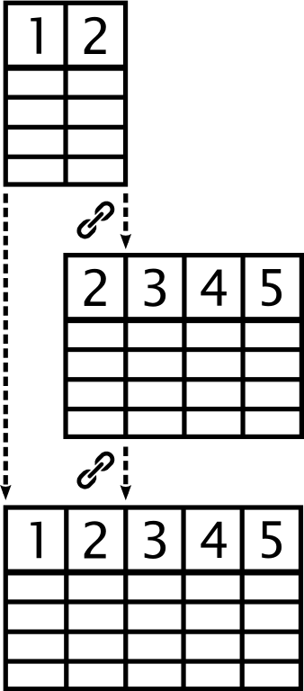
Figure 23 – Merging two tables together by linking one or two sets of matching column data (click image to zoom).
To help us take a deeper dive into the additional data we’ve added to our exported node table, we could use a rapid chart creator like Tableau Public. Designed for PCs (although a Mac version is in the works), Tableau Public makes it simple and easy to make pretty complex visualisations with up to 100,000 rows.
Measuring content quality
Let’s pose a question for the data to answer:
Q. Is there a perceived difference in the quality of content maintained in-house by Cross Country Coaches and through their external partners?
By importing the data I’ve been able to create a simple set of bar charts which tell us what each content source scored out of five for Actionability, Accuracy and Usability for the content they are responsible for (Figure 24).
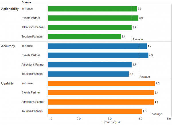
Figure 24 – Bar chart created in Tableau Public showing the average scores for each content source (click image to zoom).
From the chart it is clear that Tourism Partners scored below average for each criteria. As they are primarily responsible for the content for each town and city destination, let’s filter the data further to generate a breakdown of the scores for each (Figures 25, 26, 27).
Measuring the actionability of the content for each town and city destination
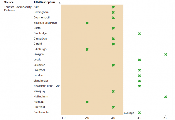
Figure 25 – Bar chart created in Tableau Public showing the Actionability scores for each town/city destination (click image to zoom).
Measuring the accuracy of the content for each town and city destination
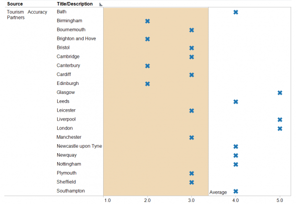
Figure 26 – Bar chart created in Tableau Public showing the Accuracy scores for each town/city destination (click image to zoom).
Measuring the usability of the content for each town and city destination
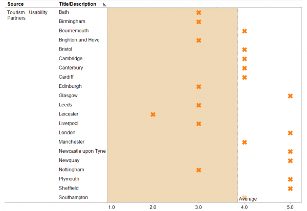
Figure 27 – Bar chart created in Tableau Public showing the Usability scores for each town/city destination (click image to zoom).
Looking at each of these scatter plots there a few recurring destinations which scored below average, particularly Brighton and Hove and Edinburgh who scored two out of five for both content actionability and accuracy. While it would be fair to say that these destinations should be first in line for a review, could data from external sources help with prioritising our efforts? Let’s bring some into play.
Using external data
To investigate whether external data could help us, I downloaded data on domestic tourism statistics between 2009-11 from VisitBritain.org. The only problem was that the data wasn’t in a raw state, but rather housed inside a PDF file. Thankfully, you can save hours of re-keying and checking by using some of the free PDF-to-Excel conversions available. I’ve had success with both PDF to Excel Online and Zamzar.
Once more we can call upon the services of Google Fusion tables to merge our data for each town and city destination with the downloaded VisitBritain.org data (Figure 28).
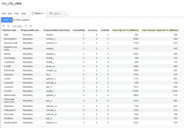
Figure 28 – Using Google Fusion Tables to merge our data for each town and city destination with the VisitBritain.org data (click image to zoom).
Now let’s map the data using Tableau Public (Figure 29). Included are bubbles marking the location each town and city from the Cross Country coaches data. The bubble sizes represent the total domestic tourist trips made between 2009-11 (in millions), and their colour intensity represents the total tourism spend between 2009-11 (in millions).
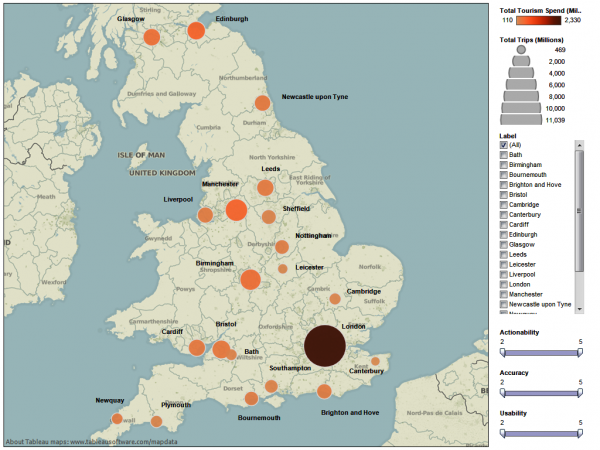
Figure 29 – Map of British isles showing tourism data for each town and city destination (click image to zoom).
Unsurprisingly, London take the prize for the largest and darkest bubble. As the capital of England will always remain a priority, we’ll remove it from the map and, in the process, observe the rest of the British Isles breathing a huge sigh of relief (Figure 30).
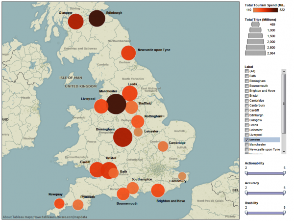
Figure 30 – Map of British isles showing tourism data for each town and city destination excluding London (click image to zoom) (click image to zoom).
Let’s now use the sliders to filter out the destinations which scored the highest for Actionability, Accuracy and Usability (Figures 31, 32).
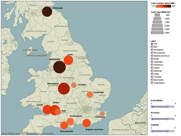
Figure 31 – Map of British Isles showing tourism data for each town and city destination that scored between 2 and 4 for each content quality criteria (click image to zoom).
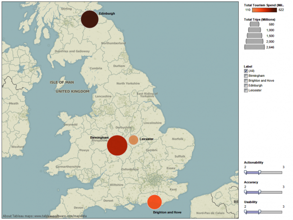
Figure 32 – Map of British Isles showing tourism data for each town and city destination that scored between 2 and 3 for each content quality criteria (click image to zoom).
We’re now left with Birmingham, Edinburgh, and Brighton as the destinations which had the highest amount of trips and spend combined with the lowest scores for Actionability, Accuracy and Usability. Might they be our priorities?
Lessons
By extending our exported node table, we were able to:
- Dive deeper by filtering and partitioning data from our own investigations
- Explore possible possible new angles and ideas by importing and presenting external data
- Develop a basic narrative around our data by adding interactive elements to our visualisations
You can do it!
Don’t be afraid to play and experiment with your data. Have fun asking questions of it. I have found that approaching it with such a mentality means it often yield its secrets and stories with surprising ease. And though we often associate numbers with authority and certainty, uncertainly can be a great way of raising new questions and sharing them with others. Getting your work in front of people might mean you get help and co-operation back.

Pingback: Putting people first » Visualising data: seeing is believing
Pingback: Visualizing data | Remobiling
How did I not see this? Mega thanks for the shoutout!