The Importance of Visualisation – Mapping the Way Forward
This is the tidied-up transcript of a talk I gave a month ago at the Content Strategy Forum 2013 in Helsinki, Finland. It was the third consecutive year I’d spoken at the forum and it was quite possibly the most enjoyable talk I’ve given to date.
Note: Though I’ve included screenshots of the most important slides, you might prefer to read along with the full deck.
The importance of visualisation – mapping the way forward
As our species’ love affair with maps is about as old as civilisation itself, I’d like to begin today’s talk by briefly going back all the way to the beginning of human existence. Long before humans could write we have been making and using maps to make sense of the world around us (Figure 1). Each example offers a snapshot into a different time and culture, as well as a unique insight into the political, cultural, and spiritual forces that drive society.
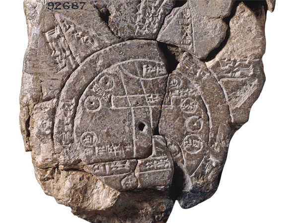
Figure 1 – Babylonian map of the world. Clay tablet, probably from Sippar, southern Iraq (c.700-500 BC) © Trustees of the British Museum
Every blank surface you can possibly think of – be it of rock, clay, wood, parchment, paper, or tapestry – has been used to plot places and objects according to their relative spacial positions. And it’s this synthesis of science, art, and history that combines to create these beautiful objects. Every map has its own story to tell and harbours secrets it may never fully reveal. A map can delight, surprise, and unsettle in equal measure. And maps can reveal deep truths – not just about where we’ve come from, but about who we are.
Throughout history the map has demonstrated its versatility. They’ve had an administrative use in marking out national boundaries or individual plots of land, a social use in showing who lives where, a military use in depicting the layout of enemy positions, and a political or propaganda use in showing one country or faction over others. But beyond their two-dimensional depictions of a physical world, maps also afford us the freedom to express the cosmos; to make all kinds of ideas about the spatial relationships of multiple components unexpectedly clear. To draw one is an effective way to establish order on an otherwise chaotic environment. To make it navigable. To make it rational.
City maps are a fine example of creating this impression of order. The whole objective behind creating such a map would be to somehow capture, contextualise, and impose order on an environment which is always moving, growing, and changing. An environment which is falling apart and burgeoning at the same time.
As content professionals, we’re often tasked with making sense of complex, unpredictable, and mostly disorderly environments – home to micro communities with their own agendas, rules, and systems of government. Managing content, processes, and people can be a complex endeavour, and managing them in large systems only increases the complexity.
In his famous map of London published in 1747, John Rocque shows off the perfect enlightenment city (Figure 2). It’s clinical, controlled, and beautiful. This is a map of London at its most picturesque. It’s a map that imposes order on a city of unrelenting change, and it gives all the appearance of objective truth. Rocque has deliberately left out the ugly, unsavoury elements of the city.
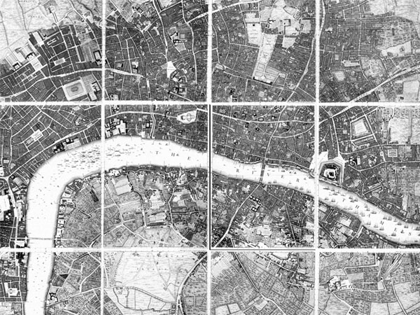
Figure 2 – John Rocque’s 1746 map of London, which deliberately ignored the city’s unsavoury elements.
To Rocque, it was more important – and lucrative – to present and promote London as the greatest city of its time than it was to present some of its grimier realities. Indeed, mapmakers through the ages have always responded to the mentalities, and met the requirements, of the societies in which they have been created. They quickly learnt that the quality and effectiveness of a map couldn’t simply be judged by its scientific precision, but by its ability to serve its purpose. Without question one of the huge appeals of Rocque’s map was that it successfully imposed order on chaos (Figure 3). This was a visual interpretation of London which offered its inhabitants a sense of promise and a sense of pride as well. To Rocque this map was about imposing clinical precision onto a city which he knew couldn’t literally be accomplished. Why? Because of the human element. And this is the main issue: The thing about cities, like large multi-departmental organisations, is people, and people just make it into a bit of a mad-house.
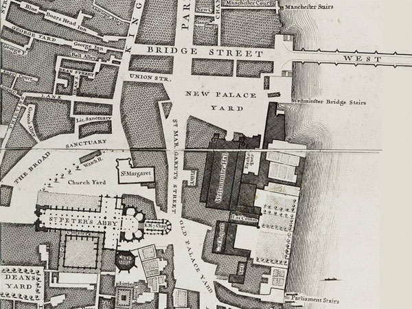
Figure 3 – One of the huge appeals of Rocque’s map was that it successfully imposed order on chaos.
If we took it upon ourselves to map a complete and literal visual representation of the way content flows within a mid-to-large organisation, we would, in a sense, be mapping a sprawling city. Such a multiplicity of information would need serious reining in if it were not to cancel itself out in a sorry mess. In the end all drawn city maps, however much they distort the truth, are trying to take on the impossible: They are trying to impose two-dimensional order on the chaos that is urban life.
So we’ve learnt that the quality and effectiveness of a map cannot simply be judged by its scientific precision but by its ability to serve its purpose. Aesthetic and design considerations are every bit as important as the mathematical, and often more so. Indeed, maps of this nature have long served as vital political and negotiating tools. In these cases the intended information inherent to the map has to be conveyed in a way that attracts the eye to certain features. Believe it or not but all this can be achieved with even a simple sketch map. Everything that maps are used to represent: placement, proximity, overlap, distance, and direction can consist of only of a few lines and a few letters, with nothing but the essential features remaining (Figure 4). In short: The simpler the better. Maps like this can be used to quickly and clearly communicate our ideas to others. And if sketched in their presence, you can even use them to tell stories.
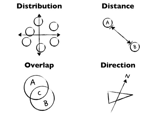
Figure 4 – Everything that maps are used to represent: placement, proximity, overlap, distance, and direction need only consist of a few lines and a few letters.
Every day we come into contact with various kinds of maps which, on the surface, may look wildly different, but they all share the same basic building blocks (Figure 5). It’s all about picking out the people, places, and things – indeed anything whose relative positions we want to compare – and picturing them in a geographical landscape.
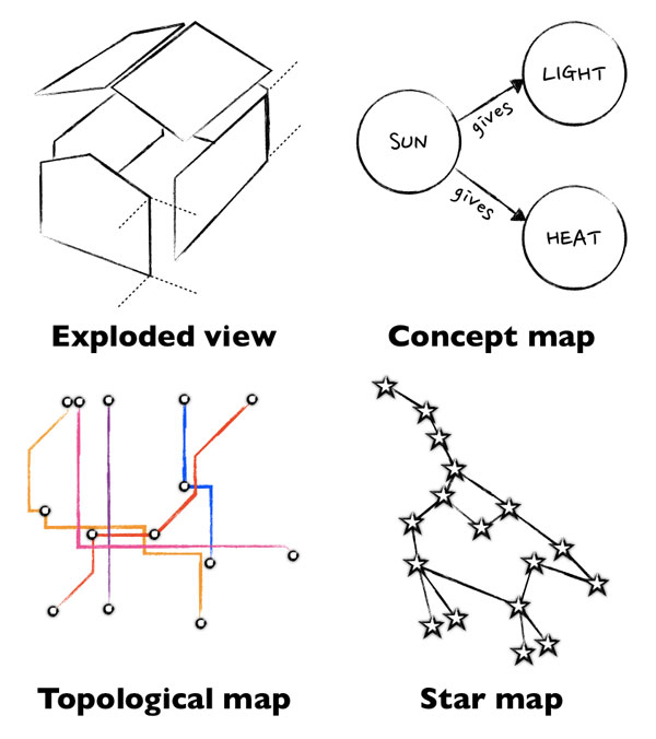
Figure 5 – Different maps, same basic building blocks: Exploded view, Concept map, Star map, and Topological map.
The only real challenge is coming up with a meaningful coordinate system (Figure 6). We’re all well versed in the north-south versus east-west coordinate system, but we can make a map of anything using other pairs of opposites like expensive-cheap versus high-low and fast-slow versus small-large.
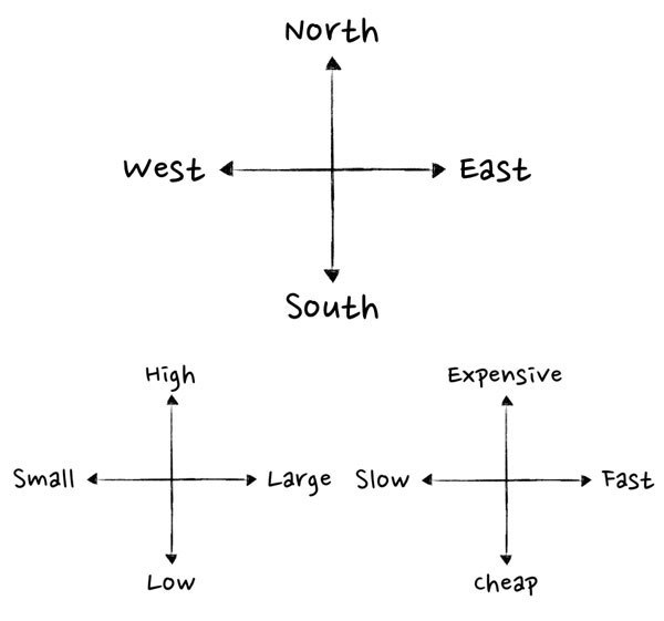
Figure 6 – Finding your coordinate system. Anything can be mapped using pairs of opposites.
Once we’ve defined our coordinates we can start to plot our landmarks (Figure 7), beginning with the most prominent feature of our landscape. This could be an object, person, or an idea.
Figure 7 – Plot your landmarks, starting with the most prominent feature.
And then we can move outward (Figure 8), adding more and features and details, illustrating everything from borders and distances to pathways and sets of shared traits. Let’s make a map!
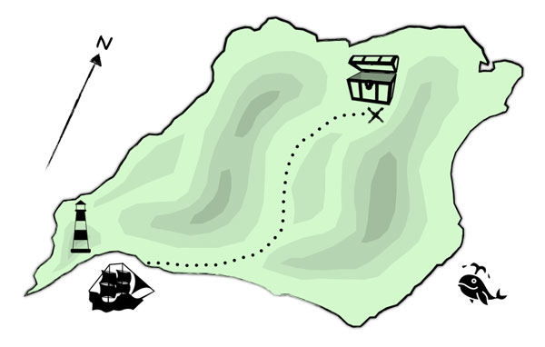
Figure 8 – Move outward by adding more landmarks to you map.
The unfamiliar environment – finding our way
When it comes to getting a grip of that complex trinity of content, processes and people, governance is an important tool (Figure 9). Put simply, governance determines how key decisions are made and who has the authority to make them. Governance defines who is allowed to create, approve, and publish content, and how these decisions are initiated and communicated.
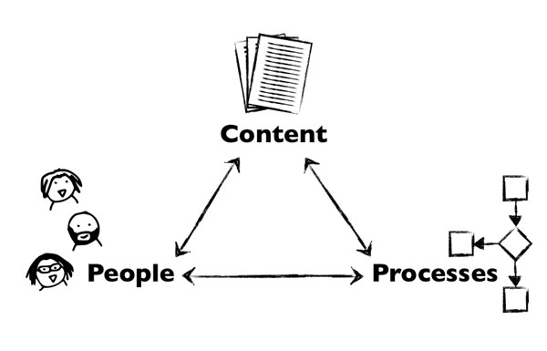
Figure 9 – When tackling that complex trinity of content, processes, and people, content governance is an important tool.
One big content governance challenge is maintaining consistency with messaging, communication, editorial and content standards throughout an organisation. This is made particularly difficult when many contributors have other responsibilities and priorities besides content. Governance is primarily a human management issue, but one useful way to help maintain these standards is through content management system (CMS) workflow. This functionality helps manage the sequence of steps from adding or editing to publishing.
Let’s imagine we’ve been hired by a regional English Council to design a new content workflow for their CMS. This council is one of 27 large two-tier non-metropolitan counties used for the purposes of local government in England. Approximately 15,000 staff across seven departments are responsible for providing services to 700,000 local people including education, social care, transport, and culture and leisure. Unsurprisingly, it’s a varied, siloed environment. Some departments take responsibility of hundreds pages on the public website, others only a few. And in the middle of it all is the relatively small Digital Services department trying to keep everyone’s content balanced and consistent.
If you were about to be airdropped into unfamiliar, and possibly hostile, territory, you’d want to be carrying either a map or pairing up with a native guide. So as an outside consultant arriving fresh into this large, diverse, politically-charged environment, your first instinct in making sense of it should be – besides asking for directions to the nearest coffee machine – to draw a map. In order to work out how decisions about content are made around here we need to figure who best to talk to besides Mandy, our main point of contact from the Digital Services department (Figure 10) – particularly those who might be influential to the way things work without even realising it. And to start this process we first need to map out our landscape.
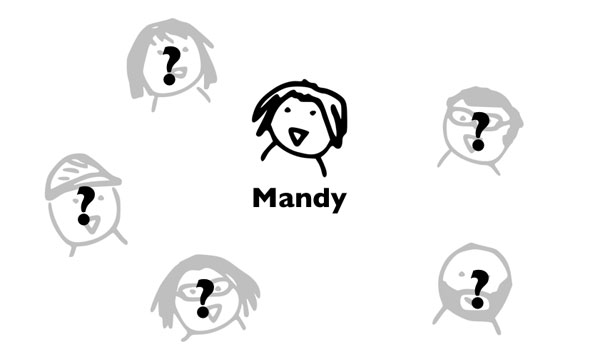
Figure 10 – To discover how content decisions are made and how they could be improved in our varied, siloed environment, we need to figure out who best to talk to.
Since we’ve just arrived in this new environment let’s start by placing ourselves and the rest of the Digital Services department on the map. Next we want to add in the six other council departments (Figure 11): Adults & Communities, Chief Executive’s, Children and Young People, Community Planning, Corporate Resources, and Environment and Transport.
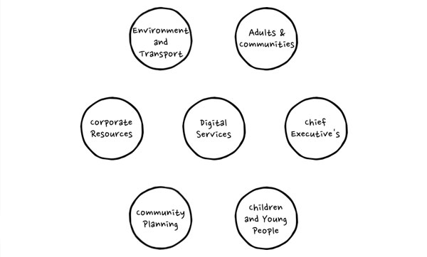
Figure 11 – To begin mapping our environment, we’ll mark out each of the seven departments.
Now we need to introduce a coordinate system (Figure 12). So let’s plot our departments by their relative sizes from small—large, and we’ll also ask Mandy how quickly each department takes, on average, to move through the gears of creating, approving, and publishing content.
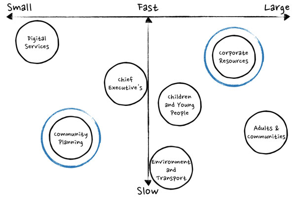
Figure 12 – To devise our coordinate system, we’ll rank each department by their relative sizes and how long their content takes, on average, to go from creation to publication.
Our department’s are plotted, so what can we see? If we’re looking for best performing department we need look no further than Corporate Resources, who, despite their large size, are one of the most efficient at delivering content. On the opposite end of the scale are the Community Planning department, who are small and yet one of the least efficient.
Next we want to understand a little more about the politics of the place. So after surveying various members of the Digital Services department, we can map the pathways between departments that they believe share closer communicative ties (Figure 13).
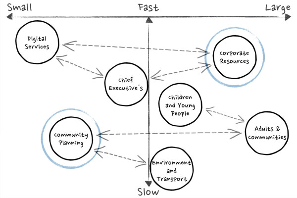
Figure 13 – Mapping those pathways helps us get a clearer picture of the politics of the place.
So what jumps out now? Our marked pathways tell us that there are two distinct groups, with one markedly quicker at delivering content than the other (Figure 14).
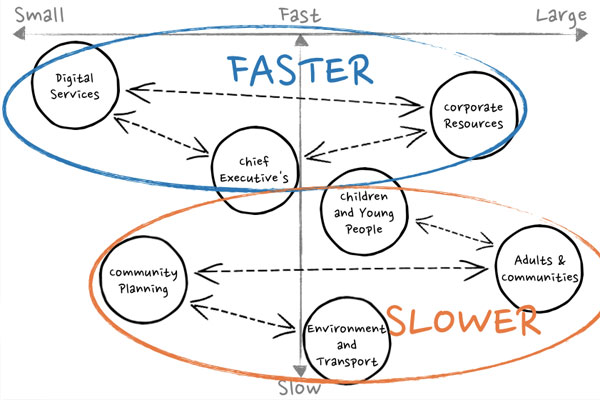
Figure 14 – What can our marked pathways tell us?
Perhaps if we wanted to bridge the gap between these two groups the Digital Services team might consider trying to form closer ties with the similarly-sized Community Planning department (Figure 15). If we could improve the efficiency of this relatively small department it might provide a positive knock-on effect. To me, the Community Planning department looks like the ideal place for a pilot project.
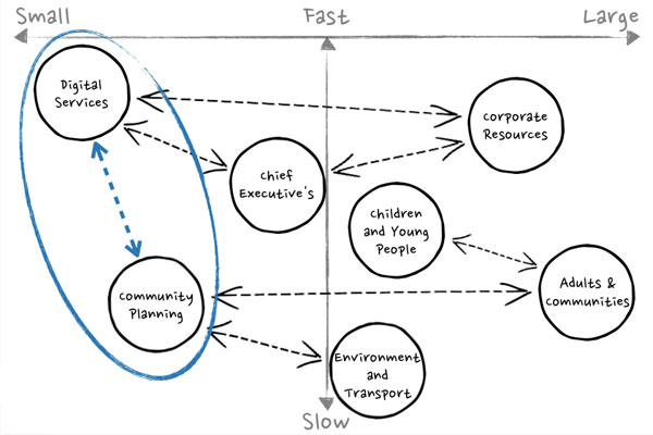
Figure 15 – Where are the opportunities for improvement?
Now we have our map. It’s by no means scientific or pretty but as I mentioned earlier the quality and effectiveness of a map should primarily be judged by its ability to serve its purpose. Our map may only consist of a few lines and letters but we now have a quick and useful overview of the council’s departmental structure. Not forgetting, of course, that we’ve only just walked through the door.
The unfamiliar environment – mapping out a process
Designing an effective CMS workflow requires meeting the needs of the organisation and each of your content players. In the case of our English regional Council scenario, this is our team of authors spread far and wide across the seven departments. To understand how we can improve the author experience we need to ask each of our content stakeholders to describe their current process for planning, creating, and publishing content.
In our conversation with Mandy, Content Officer in the Digital Services department, she kindly talks us through the typical process for publishing a press release on the council website. I’m not an especially quick note-taker so I always ask permission to record the conversation.
I was always taught never to read your slides, but hey-ho.
“On Monday she received a request from John, Highways Manager at the Environment and Transport department, to publish a press release to inform the community of the start of major road improvement work. She first called Helen, Technical Services Manager at the Environment and Transport department, who emailed through the source material and directed her on the technical details that needed to be included.
She continues…
“After completing the draft in the CMS environment, she marked the press release as ‘ready for review’ and emailed Rachael, a Content Manager and colleague in the Digital Services team, and Helen again for their feedback. After one or two line edits, she was ready to mark the press release as ‘ready for publishing’, so she emailed David, a Digital Media Officer to prepare and publish the press release to the test server.
She continues…
“John, Helen and Rachael were all emailed to help her perform a second review of the content, where they duly approved its publishing to the public website. David then got all the glory as usual by hitting the button marked ‘publish’.”
Now, I don’t know about you but I’m lost. The hardest part of these conversations is keeping track of all the different people, roles, and departments as they’re reeled off. When we hear four, five, six names or more it can be difficult to process them; to find form of the relationships between them. To make sense of this complex drama we can make a map that shows who each character is, how many there are, and how directly and indirectly involved they are in the story.
Let’s begin by listing all the characters we heard just then and their roles before sketching their likeness (Figure 16). Don’t worry too much about accurately portraying their looks. You may not have even met them before, but it’s always a good idea to put a face to a name.
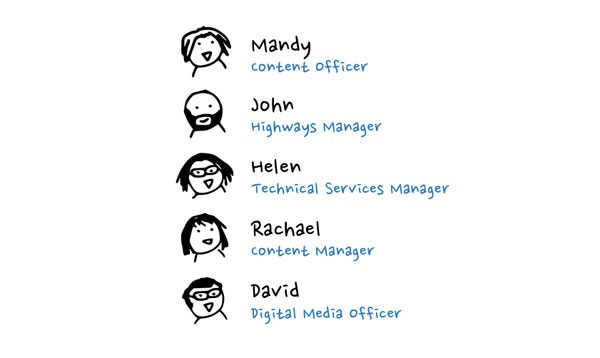
Figure 16 – Who are the players in our story?
Next we need to separate them by department and plot each interaction and task in chronological order from the initial request to the press release’s publication (Figure 17).
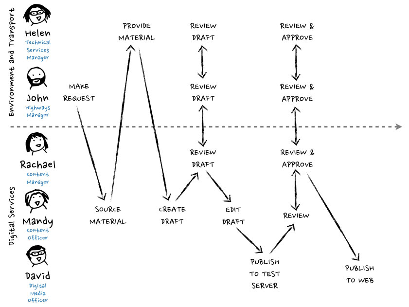
Figure 17 – Plotting each interaction and task belonging to each character in chronological order (click image to zoom).
This is good. We can clearly see the different roles each character plays and the interactions between them. We can follow this process from the initial request, the research and gathering stage, the creation and subsequent review of the first draft, publishing the draft to the test server, the second round of reviews and approvals, and finally publishing the press release to the web. But we’re still missing features of this story which would further enhance our understanding of this process and how it could be improved. Namely, which interactions and tasks took place in the CMS environment and how long each took to complete.
As Mandy almost practically saw the process from start to finish, she’ll be able to help us fill in these details. Let’s first stretch out the timeline to accurately reflect the varying speeds of each interaction (Figure 18).
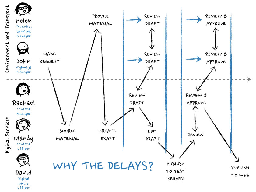
Figure 18 – Stretching out the timeline gives us a more accurate measurement of how long each task took to complete (click image to zoom).
What jumps out now? We can see that John and Helen from the Environment & Transport department took longer than Rachael to review the first draft and to review and approve the test server version. Might that just be because they have other departmental responsibilities besides producing, checking, and updating website content? Possibly. Let’s see what happens when we mark out which interactions and tasks took place within the CMS environment (Figure 19).
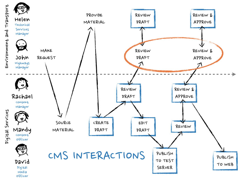
Figure 19 – Highlighting which interactions and tasks took place within the CMS environment might help us reveal where the bottlenecks are in the process (click image to zoom).
Aha! Interesting! John appears to be carrying out his reviews outside of the CMS. How come? To answer this we need to return to our first map.
We can see the Transport and Environment department are on the slower end of the scale in terms of moving through the gears of creating, approving, and publishing content (Figure 20). After interviewing Helen we learn that the department is comprised of three sub-departments: Transportation, Highways, and Environment.
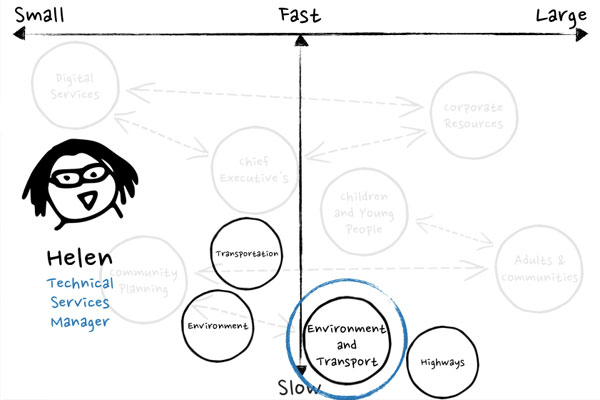
Figure 20 – Breaking down the Transport and Environment department.
John resides in the Highways sub-department, who we discover has no direct access to the central CMS because of their geographic location elsewhere in the county, and thus is effectively an external contractor (Figure 21). Helen tells us that John has to use email to communicate his requests, edits, and approvals.
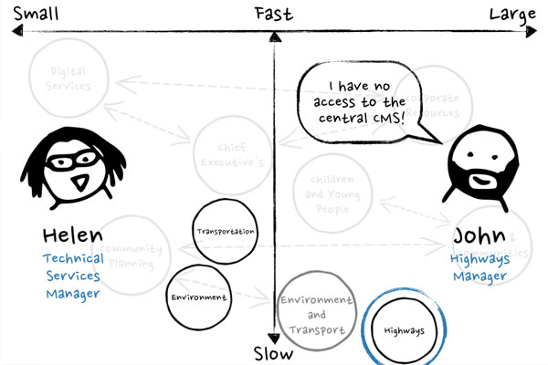
Figure 21 – John’s failing sub-department might be down to CMS workarounds adding unnecessary time and cost.
It all makes sense now. The reaction times of the Highways sub-department is adding unnecessary time and cost to this and many other content production processes. It’s compromising the efficiency of the Transport and Environment department and the entire organisation. The intrepid explorer would be wise to investigate whether other departments on the slower end of the scale may be affected when broken down like this. There could be incredible cost-saving potential across the board and opportunities to form closer collaborative ties between departments.
And all this from a couple of fairly simple hand-sketched maps.
The power of drawing – mapping the way forward
Anything to do with aligning content, process, and people is bound to be tough, messy, and complex. But remember that we and others who inhabit these environments are not completely constrained by what has happened before. It is a natural reaction of ours to try to order an environment by fitting it into the categories of our expectations. So when we cannot find a way to fit any new ideas and concepts into these simplified slots, it’s really no wonder we experience those sharp pangs of panic. But we and everyone else around us don’t have to rely on the old established categories, we can always create new ones. Our reserves of intellectual capacity are vast. Perhaps if we’re continually looking upon new ideas and concepts as chaotic and threatening this can only be because we’ve never seriously tried to make use of our potential ability to cope with the unexpected. Believe it or not, we are all amazingly inventive and resourceful, and one of the ways to bring out our innate inventive qualities is to step away from our screens and just draw.
Maps like this can be used to quickly and clearly communicate our findings and ideas to others. And if sketched in their presence, we can even use them to tell stories. It can be an eye-opening experience for everyone involved. We have to fuel our innate curiosity. We have to be willing to look stupid if it eventually leads an insight. Mistakes are just part of the process.
Just remember to keep it simple. You’re not doing it to show off. Often it’s the overly-elaborate pictures that draw too much attention to the art, rather than the idea – and it’s the idea that we want them to remember and to develop.
There really isn’t anything about this level of mapmaking that is beyond us. Make use of shapes, arrows, faces. Find your axis. Make mistakes. Start over and over again until you get it right. There is nothing to be apprehensive about. Just keep it in mind that we’ve communicated using sketched maps from the very beginning. Mapmaking fulfils one of our most ancient and deep-seated desires, which is to understand the world around us and our place in it. It’s very much a basic human instinct.
Recommended reading
- Communicating Design: Developing Web Site Documentation for Design and Planning by Dan M. Brown
- You Are Here: Personal Geographies and Other Maps of the Imagination by Katharine Harmon
- Blah Blah Blah: What To Do When Words Don’t Work by Dan Roam
- The Back of the Napkin: Solving Problems and Selling Ideas with Pictures by Dan Roam
- Maps of the Imagination: The Writer as Cartographer by Peter Turchi